Windows 8 Desktop VS Windows 8 Start Screen
The Windows 8 desktop is a confusing concept. For years, Microsoft has given us versions of their Windows operating systems with a desktop, desktop icons, desktop shortcuts, desktop wallpapers and heck, even desktop gadgets.
Then came Windows 8.
If your computer is running Windows 8, your screen may look something like this (as soon as you have entered your password and are logged on). This is called the Windows 8 Start Screen.
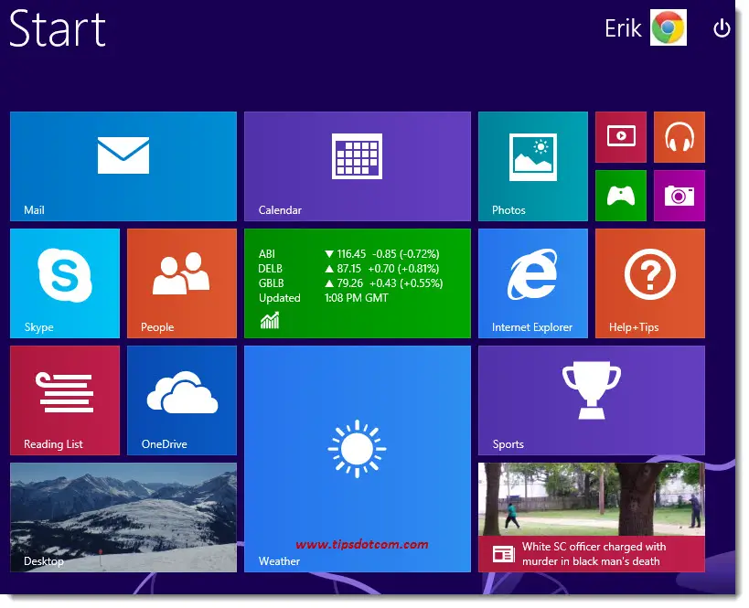
And now what?
Well, as unfortunate as it may seem (the fact that you have to adapt to a new user interface), it’s really not hard to learn the new Windows 8 Start Screen. I’ll show you in a few easy steps how to completely master the Windows 8 Start Screen.
The Windows 8 Desktop – Getting Around
It’s important to understand that Windows 8 has two modes: the Windows 8 Desktop mode and the Windows 8 Modern UI mode. Most applications (Apps) and programs can operate in either one of the two modes, allowing you to decide which mode you want to use.
Let’s take Internet Explorer as an example. Internet Explorer is one of the programs that can run in the Windows 8 Modern UI mode as well as in Desktop mode. To launch Internet Explorer in Modern UI mode, go to your Windows 8 Start Screen and look for the Internet Explorer tile (icon).
If you’re not already on the Windows 8 Start Screen, you can get there by pressing the Windows key on your keyboard.
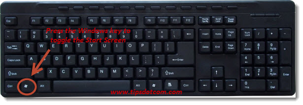
The Windows key on your keyboard will toggle between Desktop mode and Windows 8 Modern UI.
In your Windows 8 Start Screen, click the Internet Explorer tile to launch Internet Explorer.
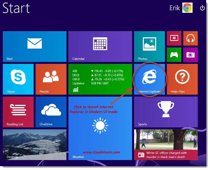
When launched in the Modern UI mode, it will look like this:
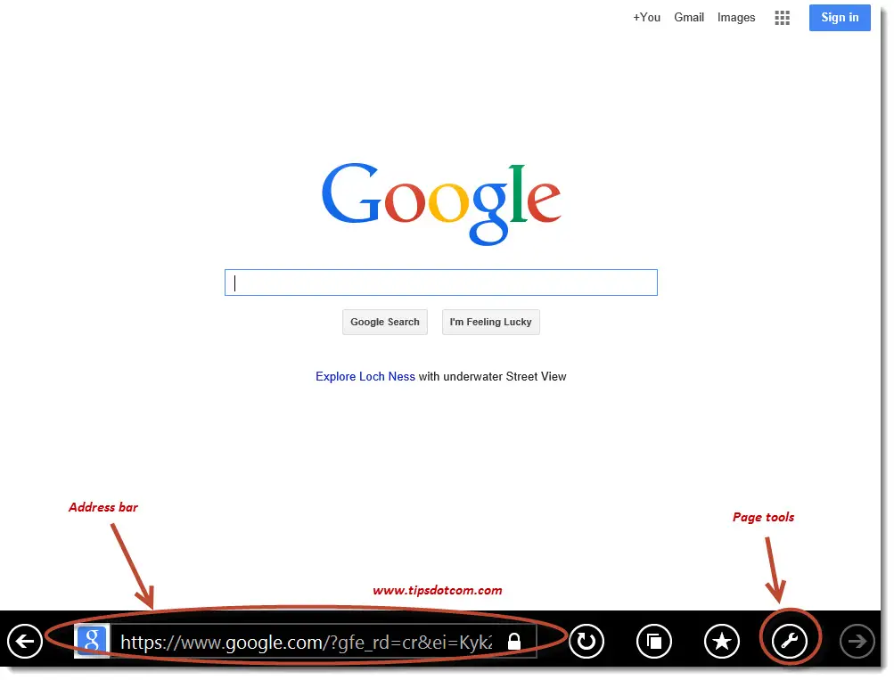
Note how the address bar is located at the bottom of the screen as opposed to on top where it always used to be in “Desktop mode” versions of Internet Explorer. Clicking the Page tools icon and then selecting “View in the desktop” ...
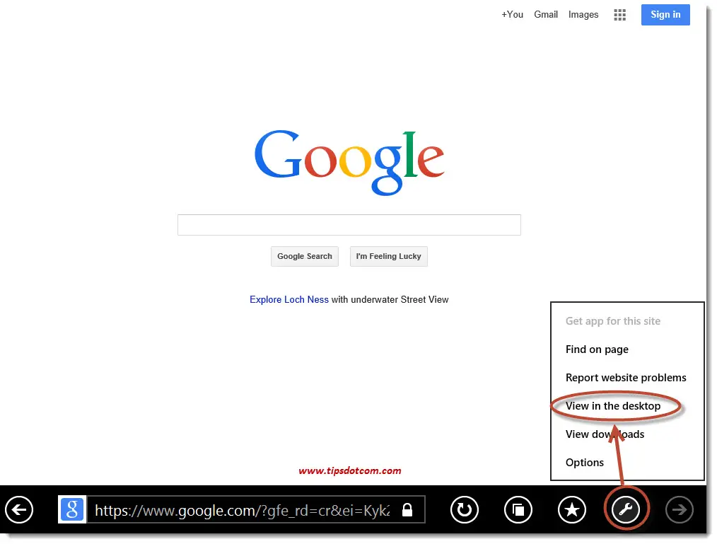
... will make your Internet Explorer session switch to Windows 8 Desktop mode, which will look more familiar if you’re used to running Internet Explorer on previous Windows versions:
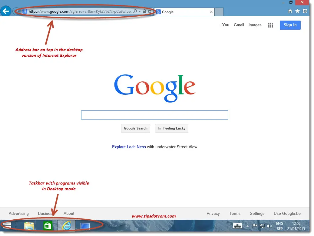
Now that you have once instance of Internet Explorer running in Windows 8 Modern UI and another in the Windows 8 Desktop mode, you can easily switch back and forth between the two instances. To do so, move your mouse pointer to the top left corner of the screen and a small image of the alternate instance of your Internet Explorer session will appear.
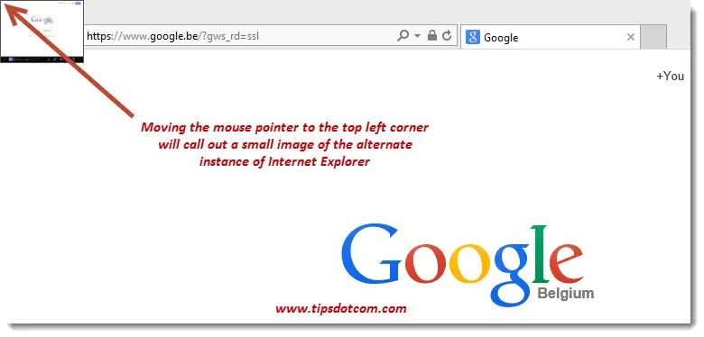
Click that little image to toggle between the Modern UI and the Desktop version of Internet Explorer.
Now, let me assure you that the vast majority of Windows 8 users who are running Windows 8 on a “normal” desktop computer without touch screen still prefer to run their programs in Windows 8 Desktop mode. As you can see in the image above (actually, two images higher), Desktop mode shows the Windows 8 Taskbar with program icons, making it very easy to switch between active programs.
That is the reason why so many users all use one and the same “tile” on the Windows 8 Start Screen and that is the one that takes them to the Windows 8 desktop straight away. That’s the one with the word “Desktop” written on it and you can usually find it at the bottom left of the Start Screen tiles, like here:
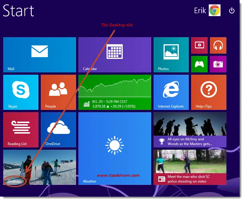
The new Modern UI takes a little getting used to and that is probably why so many people still prefer to use their programs in the Windows 8 Desktop environment. Some people say that Modern UI programs or apps have limited functionality as opposed to their Desktop counterparts. One of the things you will frequently hear is that the Modern UI version of Internet Explorer doesn’t allow you to organize your favorites in folders and that you cannot create subfolders in your favorites. The screenshot below illustrates that it *is* possible to organize favorites in folders.
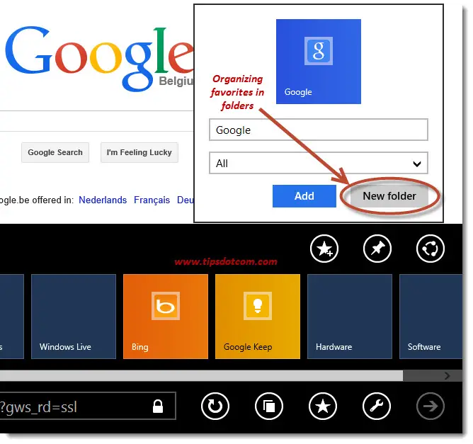
What’s more: Internet Explorer will share your favorites between its Modern UI and Desktop version, so you’ll always have your favorites, no matter which mode you’re working in.
The Windows 8 Start Screen looks dramatically different from the Windows desktops that we have grown accustomed to over the years. The reason for that is that Microsoft has decided that they will make one Windows version, which will work just as well on mobile (Windows) phones, tablet computers (like the Surface Pro) and desktop computers. On mobile and tablet devices with a touch screen, the larger icons (tiles) are simply easier to manipulate with your fingers. The classic desktop icons can get very tiny and hard to manipulate on the smaller mobile screens.
If you've enjoyed this article or found it useful, I'd appreciate it if you'd let me know by clicking the Like (or Share) button below. Thank you!
New! Comments
Have your say about what you just read! Leave me a comment in the box below.